• Home
    • Bio
    • Vita
    • Books
    • Blog
    • Performance
    • Photos
    • Contact

subscribe to entries | comments

Categories

  • New Stuff (12)
  • Poetry (28)
    • Heroes & Myth (19)
      • Batman (2)
      • Captain America (2)
      • Superman (2)
      • The Flash (2)
      • Wonder Woman (2)
    • Love (8)
  • Prose (11)
    • Wilma & Betty (6)
  • Reviews (5)
  • The Modern Geek (13)
  • Uncategorized (29)
  • Welcome (2)


  • Archives

  • March 2013 (1)
  • February 2013 (1)
  • January 2013 (2)
  • December 2012 (1)
  • August 2012 (4)
  • July 2012 (1)
  • June 2012 (1)
  • May 2012 (2)
  • April 2012 (1)
  • July 2011 (1)
  • March 2011 (5)
  • February 2011 (7)
  • January 2011 (4)
  • December 2010 (2)
  • November 2010 (1)
  • May 2010 (2)
  • April 2010 (2)
  • February 2010 (2)
  • January 2010 (5)
  • December 2009 (1)
  • November 2009 (3)
  • August 2009 (4)
  • June 2009 (5)
  • May 2009 (6)
  • April 2009 (22)


  • Co-conspirators

  • Artist: Benjamin Billingsley
  • As Was Written
  • I’m Leaving You
  • Poet: Daniel Nathan Terry
  • Selfish Father
  • SubPar Design
  • subscribe to feed

    follow me on twitter

    my facebook profile

    MG: Introducing The Modern Geek Banner

    Transmitted on Wednesday, March, 9th, 2011 in The Modern Geek

    The Modern Geek Chronicles:

    Introducing the Modern Geek Banner

    Superman’s got his “S.”

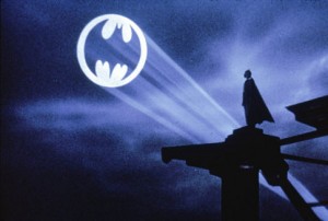
    Batman’s got his Bat-Signal.

    Dick Cheney’s got Harry Whittington’s face filled with bird shot.

    Everyone needs a symbol.

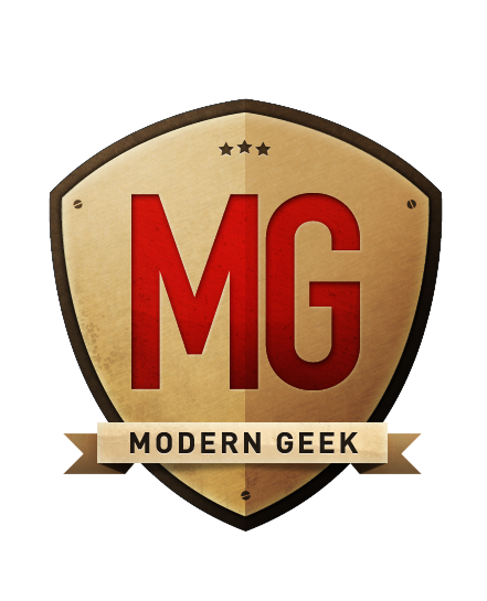
    And we Modern Geeks are no exception.  So after a couple of months of Geeking out—and gaining a larger Geek following with each post by the way (Thanks for playing along, gang!)—I’ve decided to team up with my brother over at SubParDesign to create an emblem under which all Modern Geeks might follow.

    I wanted something simple, yet awesome.  Something that would punch the unsuspecting in the mouth, steal their breakfast money and cast them into the sea.  Something that could be tattooed on the back of a CPU and double its processor speed!  Something that fellow geeks could spot from orbit!

    I’m damned proud to say that, like always, SubPar came through.  So here it is:  The Modern Geek Logo.

    So what happens now, you ask?  Who knows?  I just really wanted to show off this badass logo!  Maybe this will spark a line of Modern Geek paraphernalia.  Never can tell.  All I can say is I’m enjoying the ride and hope you are too!

    Geek you Sunday!

    More Modern Geek:
    Inception-y At McDonald’s
    Geek For So Long
    Heatsinks & Love: Seeking “Big”


    Comments are closed.

    Follow responses to this entry through the RSS 2.0 feed.
    INFO

    Pen and Cape is the portfolio of Jason Mott.
    All content copyright ©2025 Jason Mott.

    LINKS

    Site by SubPar Design. Powered by Wordpress.

    RSS

    Full Post RSS Comments RSS what is rss?